

Interactive AMA Country Data Visualization
In this interactive chart, each circle represents an AMA Innovation Lab project country by its relative poverty rate (% living on less than $1.90/day). Hover over or click the circles to display related data. Toggle the sliders to compare countries by other data points. Go back, forward or start over with the arrows at the bottom.
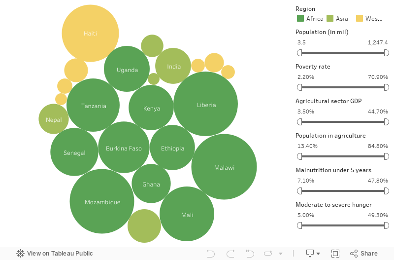
All countries included in this data visualization are current or former hosts of AMA Innovation Lab projects. All data comes from the World Bank.